Case Study | Veterinary Hospital Network | Veterinary Conference
Veterinary Conference Branding
Naming and a logo for a national hospital network's annual gathering of veterinary professionals
How one of the country's largest veterinary hospital networks asked us to give its annual professional conference a name and an identity of its own. The result is Unleashed: a mark that reads as warm and professional at once, built through eight rounds of exploration, delivered as a complete logo system, and designed to live across years of programs, signage, badges and screens.
The Client
VCA Animal Hospitals
VCA operates hundreds of animal hospitals across North America. One of its flagship hospitals hosts an annual conference that brings veterinarians, specialists, technicians and hospital teams together for education and community. The event had a purpose and an audience. It did not have a name people would remember or a visual identity that could carry it from year to year.
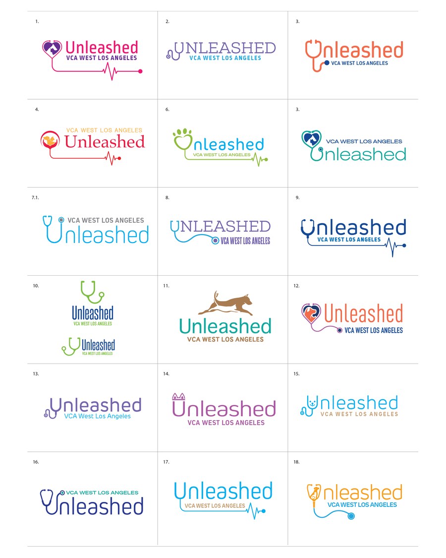
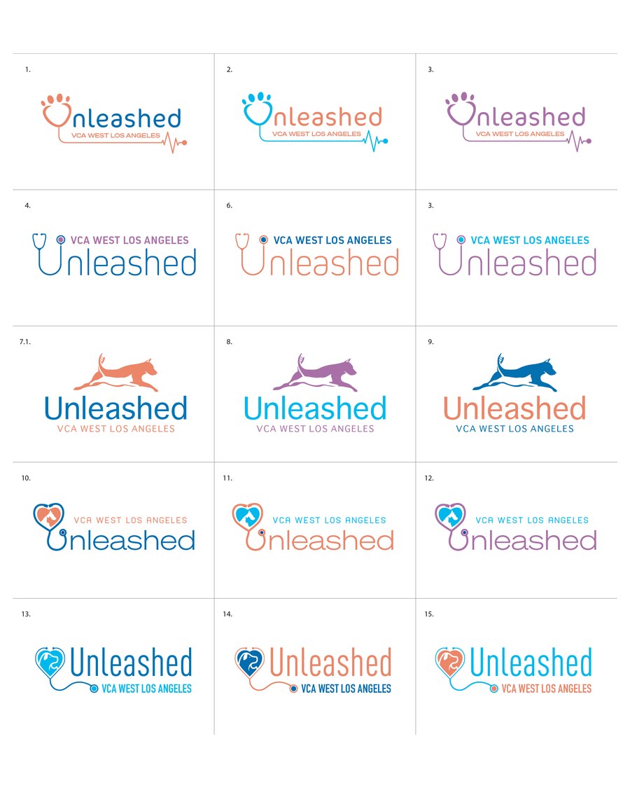
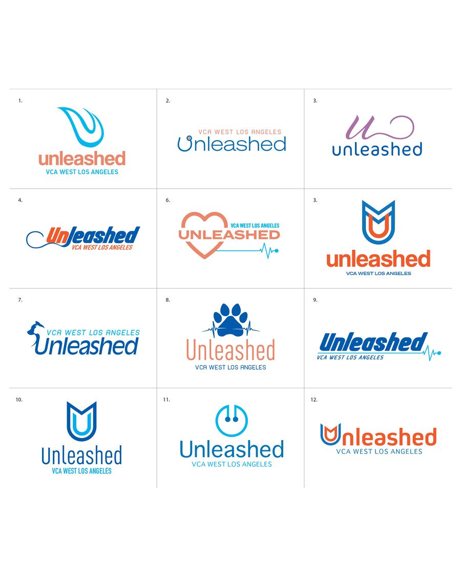
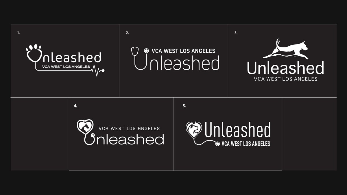
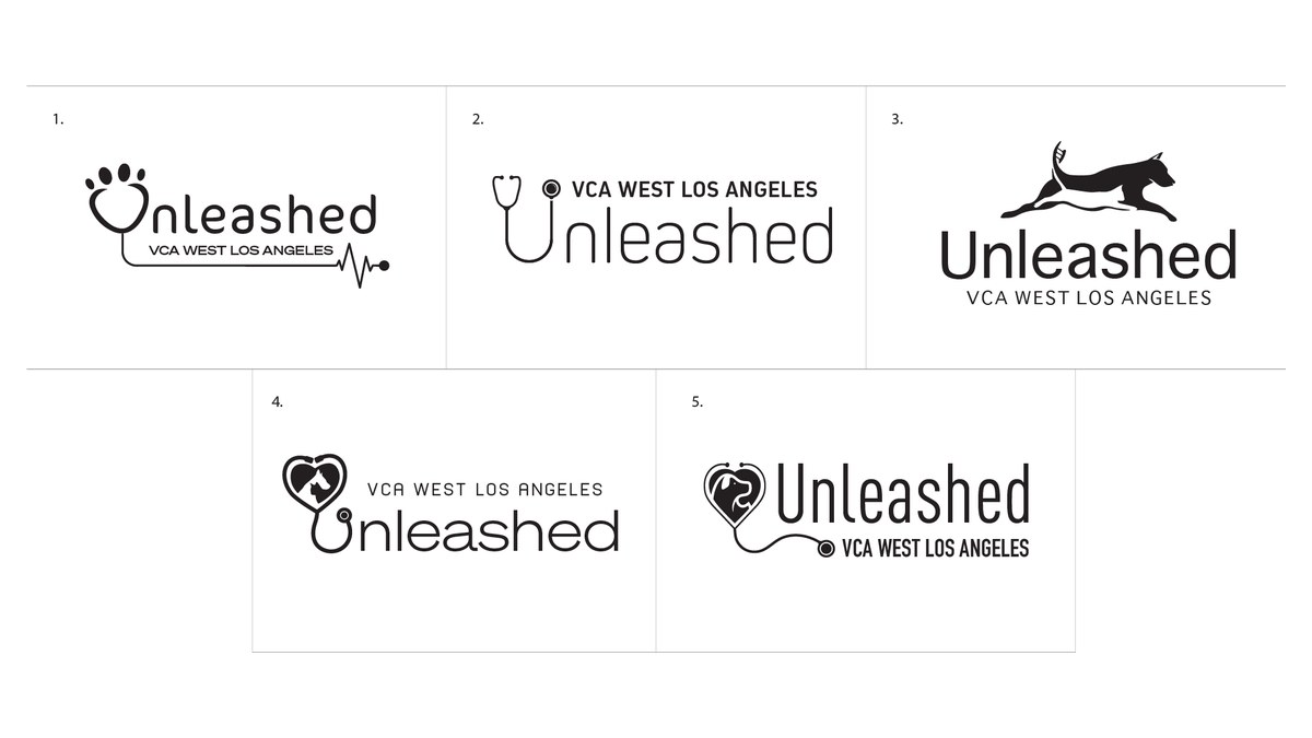
We were brought in to name the initiative and design its logo. The name Unleashed captures the spirit of the event, professionals set free to learn, connect and grow, while staying unmistakably about animals. The identity had to balance approachability with authority: this is not a sterile clinical brand, it is a room full of people who care about pets. Over eight rounds we explored wordmarks, stethoscope and heartbeat motifs, running-dog silhouettes, paw marks and monograms, then refined the chosen direction into a stacked lockup, a horizontal lockup, reversed versions, a black and white set and print-ready files. The brand is built to evolve with the conference without losing its core.
Services
By the Numbers
Objectives and Approach
Friendly Enough for a Dog, Serious Enough for a Surgeon
The audience is veterinary professionals. The subject is animals. The mark had to speak to both without tipping into clinical or cute.
A Name With Motion
Unleashed says freedom, energy and growth, and it belongs to animals without saying the word.
Medicine in the Mark
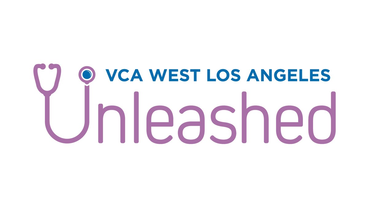
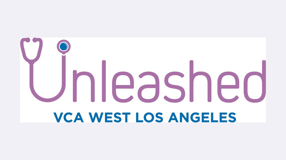
The stethoscope forms the U, so the identity carries the profession inside the name.
Room to Grow
Stacked and horizontal lockups, reversed and one-color versions, so the mark works on a badge, a stage screen and a program cover.
Beside the Parent Brand
Typography and color chosen to sit comfortably next to the hospital network's own identity.
Services Marketed
What the Conference Delivers
Exploration
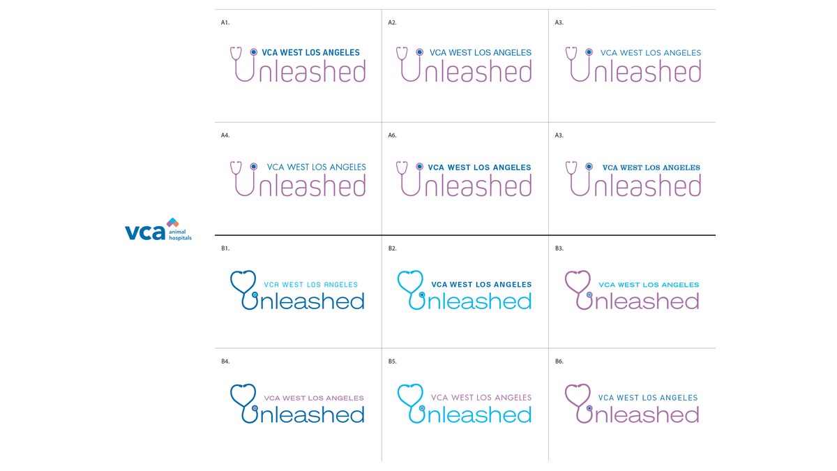
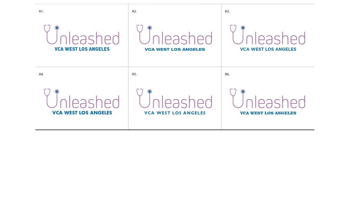
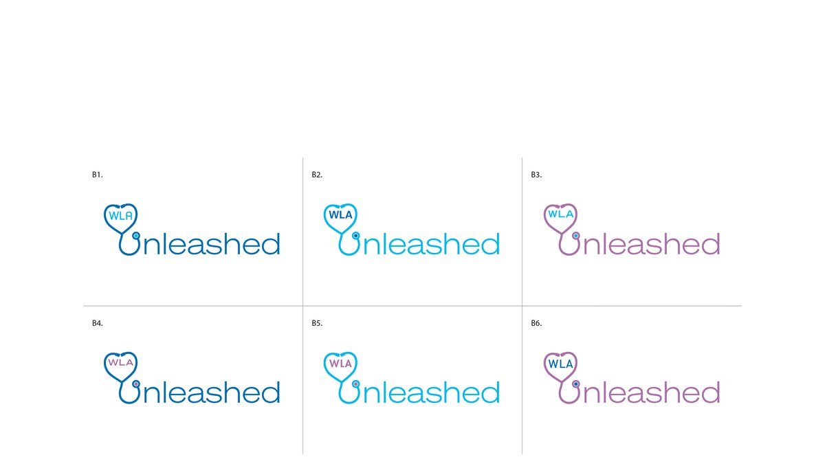
Eight Rounds to One Mark
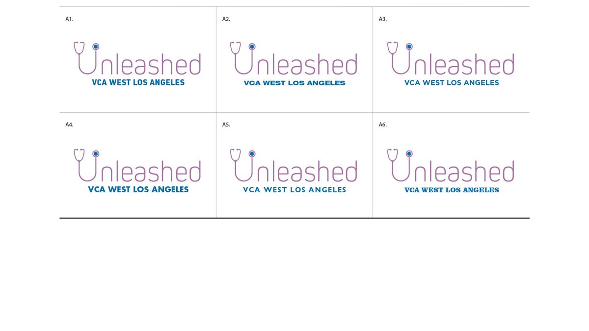
Selected sheets from the exploration, from the first wide round to the refined finalists.
Ready to Grow?
Want Growth Like This for Your Business?
Our Texas team builds the brand, the website and the marketing that bring in new customers and keep them coming back. Tell us where you want to grow and we will map out the plan with you.
Book Your AppointmentThe Identity
Unleashed
The final horizontal mark, the stacked lockup, the reversed set and the one-color set, plus the print proof.
What We Managed
Naming and Identity, Start to Finish
Impact Summary
A Conference With a Name People Remember
A national hospital network's annual gathering now has an identity that belongs to the veterinary community it serves, designed to return year after year. The same naming and identity process fits any organization launching a program, event or initiative that needs a brand of its own.
See How We Brand Medical and Veterinary Organizations